Redesigning NordicTrack.com
From a legacy site to a high-converting headless commerce experience
A full end-to-end UX redesign and platform migration that untangled a complex product range, surfaced the iFIT value proposition and drove measurable sales growth through 2024 to 2025.
-
lead UX/UI design
-
end-to-end
-
A/B Testing
-
design systems
-
ecommerce

My Role
-
Lead UX/UI Designer, Research, Wireframing, Prototyping, A/B Testing
Client
-
NordicTrack.com
Team
-
Collaborated with Product Managers, Developers and Stakeholders
the problem
What was broken
A legacy monolithic platform and outdated marketing and UX that had fallen far behind user expectations and the competition.
User Friction
Complex product navigation, confusing machine names, inability to compare features or understand the iFIT ecosystem. Low mobile conversion despite 71% of sales originating on mobile.
Business pressure
Legacy Salesforce Commerce Cloud infrastructure was slow, costly to update, and stifling innovation. Even simple changes took months. Highly competitive market with Peloton dominating brand perception.
platform context
Replatforming for scale and speed
This redesign ran in parallel with a major platform transformation, shifting from a legacy monolithic system to a modern, headless architecture designed for flexibility, speed and global scalability.
Before: Legacy Stack
Built on Salesforce Commerce Cloud, the existing platform was monolithic and slow to evolve—limiting localisation, experimentation, and speed to market. Even minor updates required lengthy development cycles, often taking months to implement.
After: Headless Architecture
-
Contentstack cms
-
commerce layer
-
next.js
-
stripe + klarna
-
cloudinary
-
AWS
“The business was unaware that we’d moved everything overnight.”
— Jason McMurdie, SVP Technology, iFIT
discovery
Research + competitive analysis
We benchmarked Peloton and Horizon Fitness to identify consumer trust signals, feature gaps and conversion patterns across the category.
opportunites
Where we focused
3. Simplify the funnel
process
Key design decisions
Design Thinking approach — from research to prototyping to validation, in fast sprints aligned to the platform migration timeline.
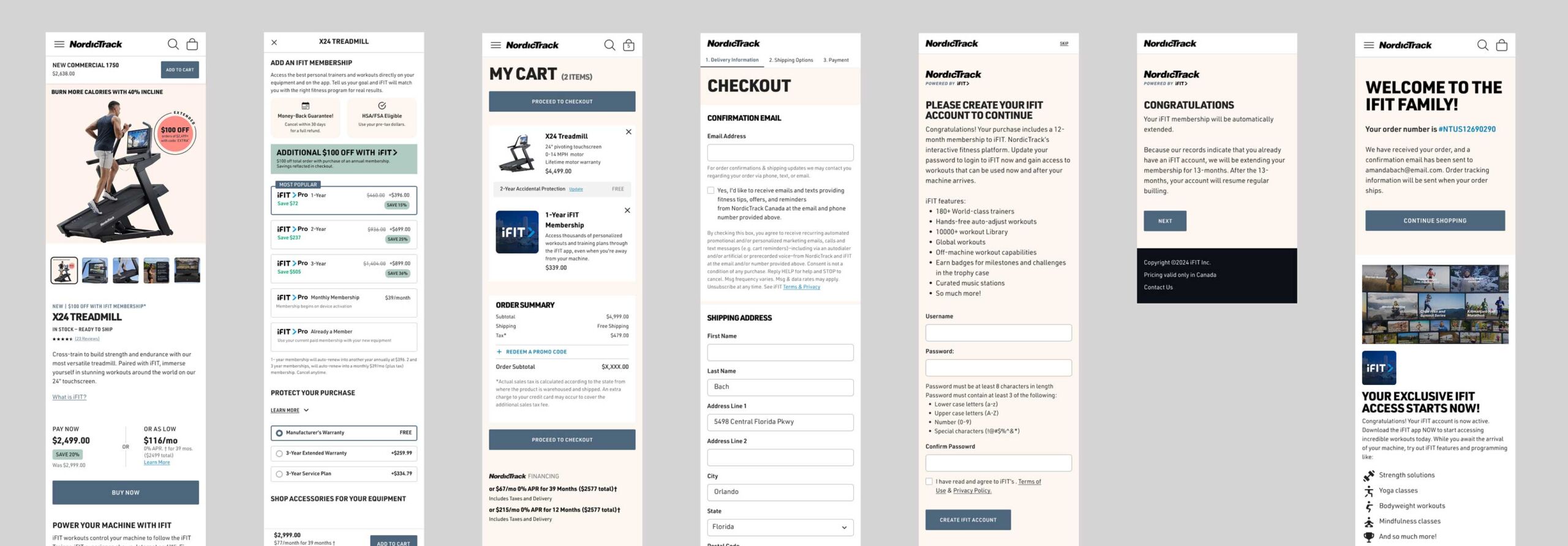
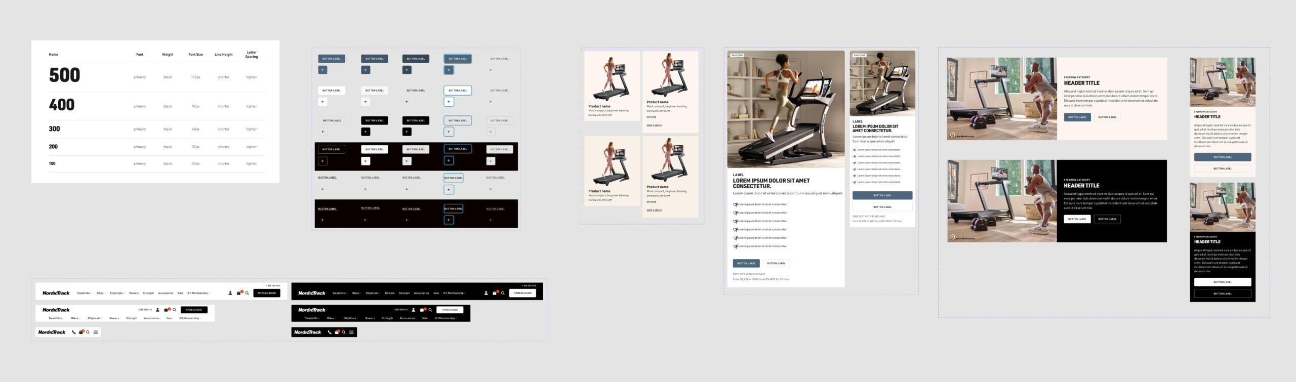
Replaced the dense, inconsistent SFCC-era UI with a modular, mobile-first system — clean typography, white space, and accessibility baked in. Built to scale across 13 international sites.
solution
Final design
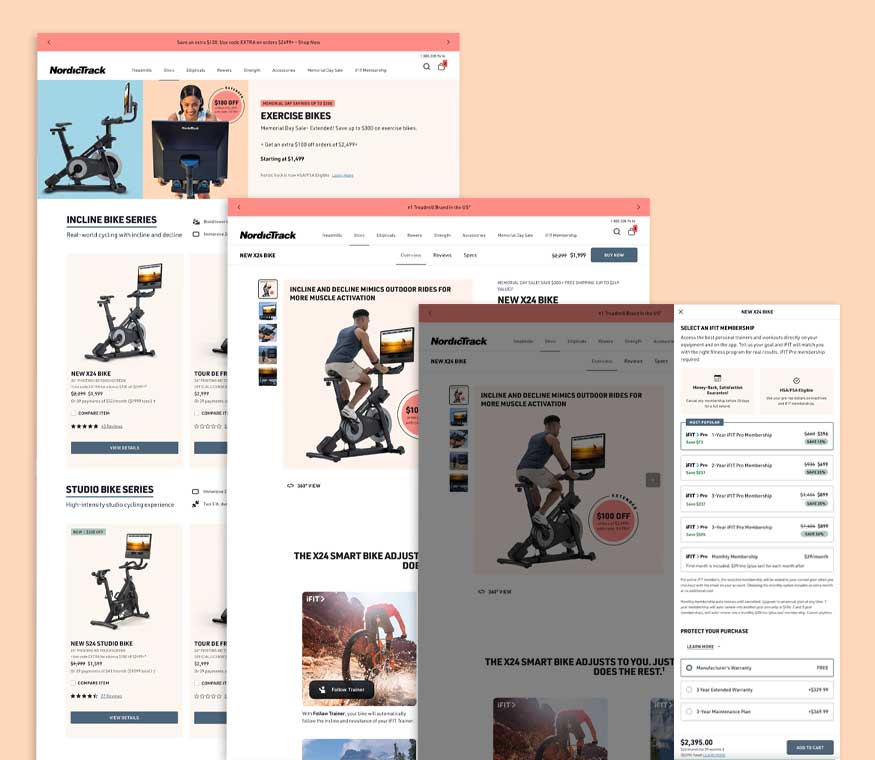
With a new direction for NordicTrack.com taking shape, I used Figma to convert the wireframes into a series of prototypes to validate design flows and content presentation. After organizing and conducting A/B tests and usability testing, we gathered direct feedback and refined the experience through iterative design sprints.
We found that majority of users navigated from homepage to cart without confusion, and users described the experience as “clear” and “easy to browse”, which was a sharp contrast from the earlier, more cluttered versions of the site.
With the HSA/FSA integration launched and the benefit cut off approaching, we made a decision to soft launch in March, with a full redesign launch planned soon after. Final designs were then handed off to development.
By the time we entered development, we had tested multiple homepages, PLP, PDP, Configurator and and site navigation, each grounded in user input and performance feedback. These design decisions helped shape a more confident, conversion-focused e-commerce experience built to scale and saw positive sales growth in late 2024 and early 2025.
impact
Outcomes + metrics
The launch exceeded sales forecasts, and saw positive growth across 2024–2025. This set the foundation for a global iFIT rollout.
0%
Improvement in page load speed post-migration
0
Global e-commerce sites migrating to unified architecture
0%
Sales completed on mobile, up from low conversion baseline
$0
Average order value: the highest in competitive set
Reflection
The phased launch was the right call, but it created some UX inconsistency during the transition period. Given more runway, I’d advocate for a longer closed beta phase to stress-test the full redesigned flow before any public rollout. I’d also push to surface iFIT subscription pricing earlier in the journey, which was late-stage feedback we could have caught in week one of usability testing.