Redesigning NordicTrack.com
From legacy site to a high-converting headless commerce experience
A full end-to-end UX redesign and platform migration that untangled a complex product range, surfaced the iFIT value proposition and drove measurable sales growth through 2024 to 2025.
-
lead UX/UI design
-
end-to-end
-
A/B Testing
-
design systems
-
ecommerce

My Role
-
Lead UX/UI Designer, Research, Wireframing, Prototyping, A/B Testing
Client
-
NordicTrack.com
Team
-
Collaborated with Product Managers, Developers and Stakeholders
The Problem
In March 2024, shortly after joining iFIT, I was asked to assist with the complete redesign and repositioning of NordicTrack, a global leader in high-performance fitness equipment. Their ecommerce site was overdue for a refresh and users were facing friction when exploring products, navigating the experience, and completing purchases, especially on mobile.
As lead UX designer, I helped reshape the end-to-end experience strategy, and partnered with product, engineering, and brand teams to align on goals, define the vision, and execute a user-centered redesign. Using a Design Thinking approach, we moved quickly from research and prototyping to validation and launch, delivering a modern, high-converting experience, grounded in real user needs.
The Challenge
Despite its legacy in the fitness space, NordicTrack’s digital experience had not kept pace with modern user expectations. The site suffered from complex product navigation, inconsistent UI/UX, and low mobile conversion rates—all of which contributed to underperforming sales. Users struggled to understand the full product range, compare features, and recognize the value of NordicTrack’s smart equipment and the iFIT app. Many were unaware of features like HSA/FSA eligibility or how the connected fitness experience worked. The challenge was twofold: streamline the shopping experience to make purchasing fitness equipment intuitive—from discovery to delivery—and reposition NordicTrack as the go-to authority in smart, connected home fitness.
Competitive Analysis
By analyzing similar offerings from Peloton and Horizon Fitness, as well as other competitors in the fitness space, I was able to identify user expectations, UX standards, and feature gaps.
What I found in these analyses were some critical success factors for trust-building and driving conversion;
- Clarity
Users need a clear understanding of what they are buying, whether it’s hardware or a bundled workout subscription. We needed to simplify product tiers and better explain the value of our app upfront. - Seamlessness
Horizon Fitness offered a simpler, more straightforward buying experience with fewer clicks and less cognitive load. Streamlining NordicTrack’s navigation, product pages, and checkout was essential to remain competitive in terms of ease and speed. - Communicating Value
Peloton successfully ties together hardware, software, and community in a single, aspirational narrative. NordicTrack had a similar offering through iFIT, but it wasn’t always front and center. Our challenge was to surface the benefits of the connected experience earlier in the journey, so users clearly understood what made NordicTrack different.
Identifying Our Opportunities
After gathering research, site analytics, and stakeholder input, we uncovered several pain points and motivations across NordicTrack’s diverse user base. Our goal was to streamline the product discovery process, clarify the brand’s value proposition, and build trust with a fitness audience seeking long-term results.
Opportunities
- Refine product positioning and collections
Users were confused by similar-sounding machine names and unclear differences between product collections. A more intuitive navigation and improved product categorization would assist the user to find what they needed. - Demystify the iFIT ecosystem
While the iFIT app is a core differentiator, many users didn’t understand how it worked with NordicTrack machines. We focused on surfacing the app’s value, highlighting trainer-led workouts, real-world destinations, and app features earlier in the user journey. - Guide users through a simplified UX
The previous site overwhelmed users with promotions and lacked clear entry points into the shopping funnel. With reduced clutter, surfacing relevant content, and using comparison tools, we could better guide the user through every step. - Build confidence
Users wanted to invest in durable equipment from a brand they could trust. Incorporating authentic peer reviews and long-term benefit messaging would help reassure users and increase conversion. - Reframe Fitness as a Personal Journey
With varied fitness goals and preferences, users were motivated by different types of workout experiences. Communicating the iFIT platform as an immersive, instructor-led series helped frame NordicTrack as more than a machine, and a path to long-term fitness success.
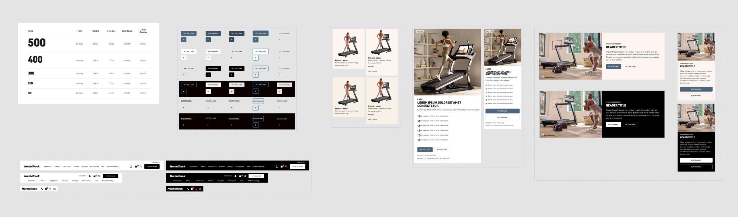
Wireframes + Early Concepts
I used Figma to create wireframes for each step of the user journey. The initial wireframes focused on:
An updated Brand Identity, Design System + UI Elements
Updated photography, improved visual storytelling
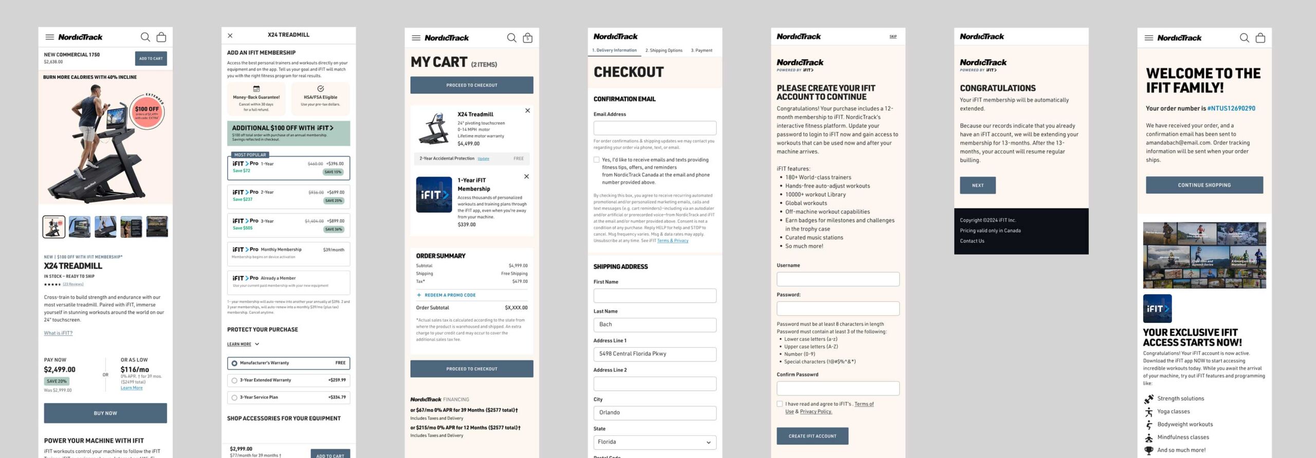
- A streamlined purchase flow that guides the user through the purchase funnel, communicating product highlights and showcasing benefits and features
A chatbot feature to assist users with their purchase
- Leveraging the CMS tool, and content blocks to make site updates easier for internal content creators/editors
Feedback from early tests suggested improvements like redesigning for accessibility, mimimizing promotional clutter and informing users earlier in the journey about the required subscription and pricing tiers
Design System Overhaul
NordicTrack’s design system was outdated and relied on a dense layout, limited white space, and inconsistent UI elements that often overwhelmed users and lacked visual hierarchy. The updated system embraced a more modern, modular system with clean typography, simplified navigation, and a strong focus on product storytelling. We prioritized clarity, consistency, accessibility and performance, optimizing for mobile while elevating the brand with immersive visuals and user-centric interface graphics.
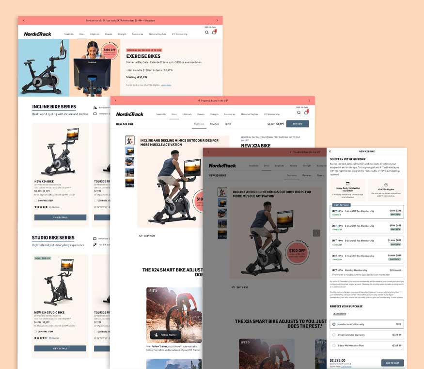
Experimentation + Iteration
With a new direction for NordicTrack.com taking shape, I used Figma to convert the wireframes into a series of prototypes to validate design flows and content presentation. After organizing and conducting A/B tests and usability testing, we gathered direct feedback and refined the experience through iterative design sprints.
We found that majority of users navigated from homepage to cart without confusion, and users described the experience as “clear” and “easy to browse”, which was a sharp contrast from the earlier, more cluttered versions of the site.
With the HSA/FSA integration launched and the benefit cut off approaching, we made a decision to soft launch in March, with a full redesign launch planned soon after. Final designs were then handed off to development.
By the time we entered development, we had tested multiple homepages, PLP, PDP, Configurator and and site navigation, each grounded in user input and performance feedback. These design decisions helped shape a more confident, conversion-focused e-commerce experience built to scale and saw positive sales growth in late 2024 and early 2025.
Outcomes + metrics
The launch exceeded sales forecasts, and saw positive growth across 2024–2025. This set the foundation for a global iFIT rollout.
0%
Improvement in page load speed post-migration
0
Global e-commerce sites migrating to unified architecture
0%
Sales completed on mobile, up from low conversion baseline
$0
Average order value: the highest in competitive set
Reflection
The phased launch was the right call, but it created some UX inconsistency during the transition period. Given more runway, I’d advocate for a longer closed beta phase to stress-test the full redesigned flow before any public rollout. I’d also push to surface iFIT subscription pricing earlier in the journey, which was late-stage feedback we could have caught in week one of usability testing.