
BillSplit is a mobile app that takes the stress out of sharing expenses. From dinners with friends to family outings, my goal was to design a seamless, intuitive experience that made splitting costs quick, fair, and free of awkwardness.
BillSplit is a mobile app designed to simplify the often awkward task of splitting shared expenses, whether its a dinner with friends or lunch with the family. The goal was to create a user-friendly experience that would make cost-splitting fast, fair, and frustration-free.
Splitting expenses isn’t always straightforward. Existing apps were often cluttered, confusing, or lacked the features people actually needed. Our users wanted:
A fast way to split and track expenses
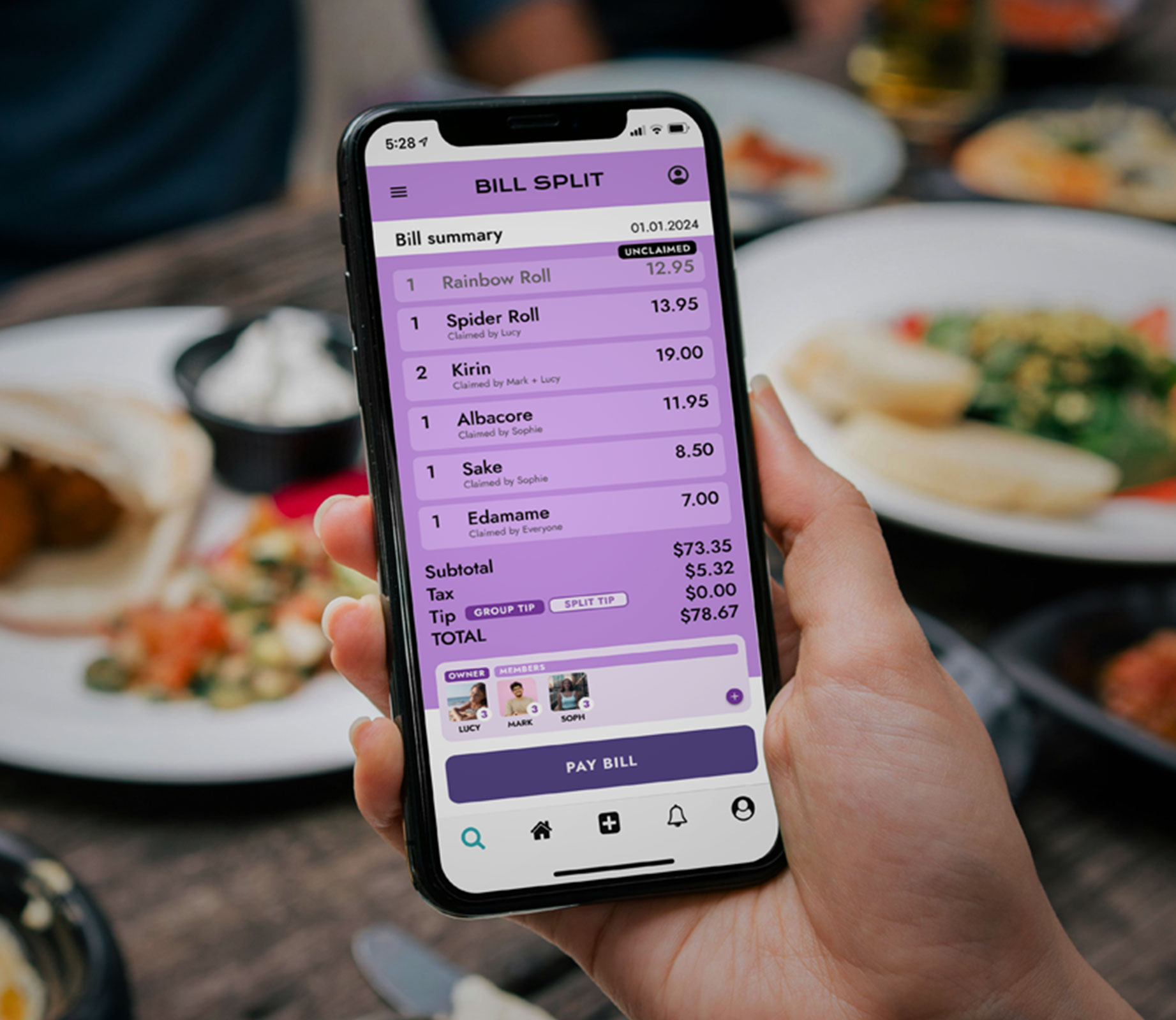
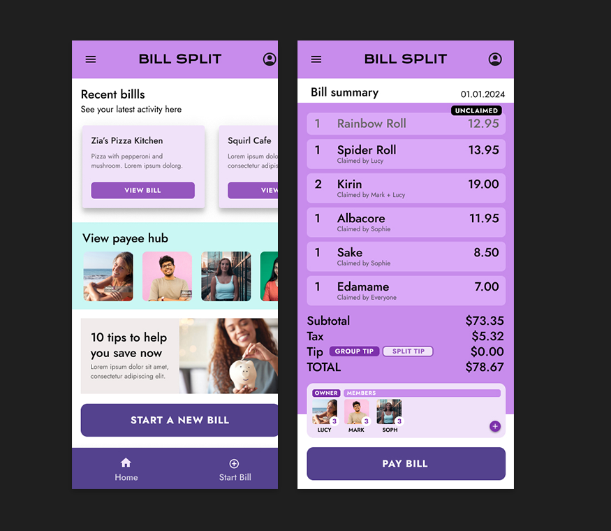
Visual clarity on who owes which item
Payment tool integration eg, Venmo or PayPal
Minimal stress and no complicated math
The problem: How can we make expense splitting easy and less stressful for users?
I interviewed 6 users who regularly share expenses with friends or family. Their pain points included:
Confusion around uneven splits
Forgetting who paid last
Poor/clunky mobile experiences
A lack of visual clarity
Key Insights:
People often hesitate to ask for money, and they want the app to “do the awkward work”
Simplicity wins over UI with overloaded features.
Users need to be able to trust the accuracy of the results
Make adding expenses happen at an instant and easily
Allow even, custom, and percentage based splits to put the user in control of all situations
Provide clear transaction history for each user
Simplify settling up with friends
Create a clean and friendly UI that is enjoyable to use
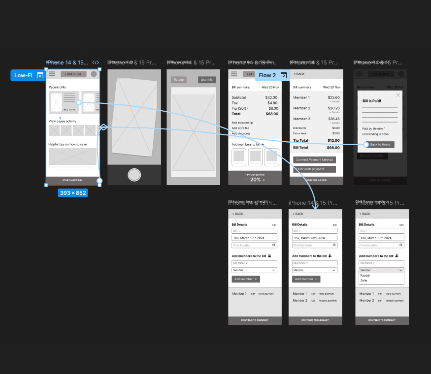
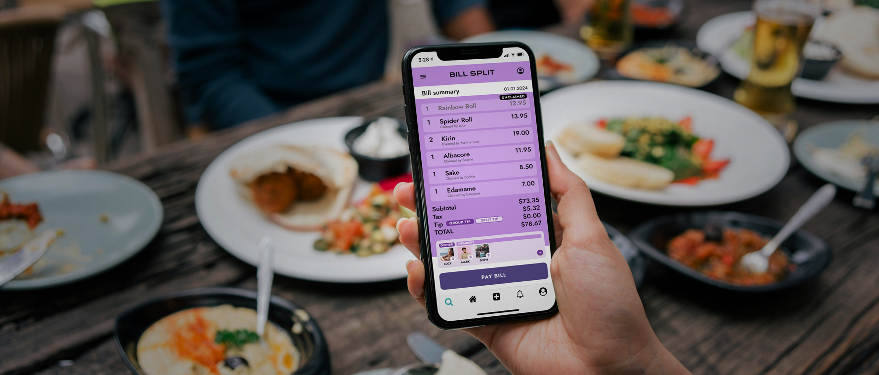
Initial wireframes focused on:
Quick bill scan flow
Dashboard with visual amounts owed
Tap-to-settle functionality
Feedback from early tests suggested improvements like color-coding user contributions, using profile images and offering custom bill-splitting options for those who ordered only one or two items
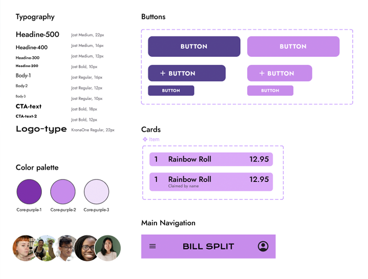
I created a a minimalist UI with rounded cards and soft shadows. For this, I used a warm and vibrant color palette for fun, friendly look and feel.
I used a clean, modern sans serif font for readability and icons that are recognizable.
I ran two rounds of moderated usability testing with five users.
Successes
90% completed split flow without confusion
Users found the app “fast” and “polite” in handling money matters
Reduced number of taps in Add Expense flow
Made profile icons bigger for better recognition
Switched debt chain view to a clearer circular layout
Post-launch feedback indicated:
Increased User Satisfaction: Users found the app intuitive and helpful.
Reduced Conflicts: Clear records minimized misunderstandings.
Higher Engagement: Frequent use for various group activities.
Through this study, I learned that this app and features arent just about logic, it’s connected to human emotion. People want tools that make hard conversations easier. Designing for empathy was at the heart of this project.
Implement group notifications
Explore recurring bill features
Beta test with a larger user group