Bon Charge
Turning a UX audit into a redesigned shopping experience for a high-growth wellness brand
Over three months, I led a full-funnel UX audit of Bon Charge’s ecommerce site, surfacing 40+ usability issues, then built the design system, configurator and CRO framework to address them.
-
Ecommerce
-
Design SystemS
-
navigation
-
CRO Testing
My Role
-
Senior UX/UI Designer
Client
-
Bon Charge
Team
-
Marketing Team, Engineering, CEO and Leadership Team
Overview
Bon Charge is an Australian ecommerce wellness technology brand. Over a three month contract, I led a full-funnel UX audit of boncharge.com, then took the findings from that audit and turned them into nine shipped and in-progress initiatives. These spanned navigation, product configuration, a new design system and conversion testing.
At a Glance
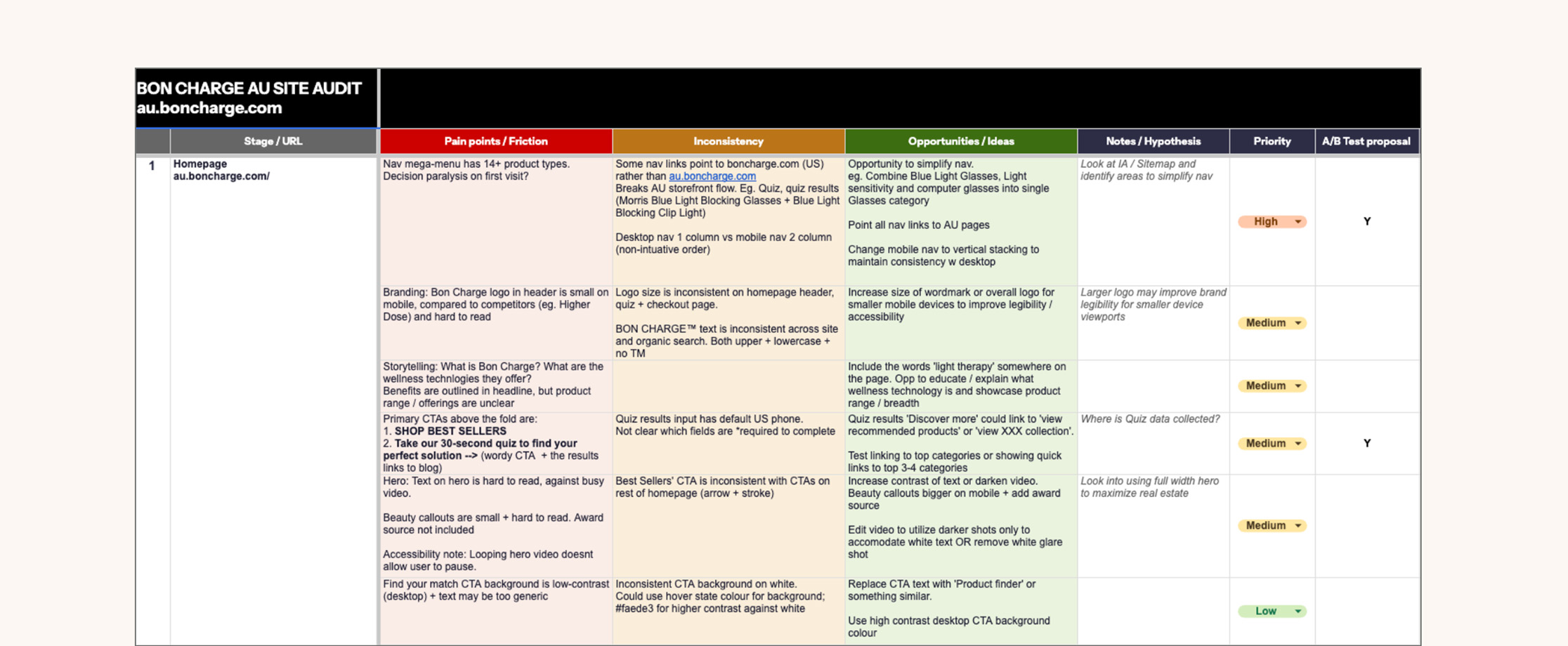
I initiated a site audit across all five journey stages; Homepage, Collection, PDP, Cart, Checkout.
0+
issues identified in audit
0
high-priority fixes actioned
0
test proposals scoped
0
journey stages audited
01 - The Problem
Navigation and AU localisation were breaking the funnel before a single product loaded.
The site audit turned up 40+ issues. These three touched every stage that followed:
- 13+ product types were crammed into one mega-menu, with limited grouping logic, creating a decision-paralysis risk.
- Nav links for glasses collections, quiz results and category pages linked to the US site instead of the localised AU site.
- US/Canada product variants surfaced to AU shoppers, with a generic “Select Options” CTA, adding another click for the user.
In addition to these were medium-priority issues; a cart item bug, a discount-code field expanded by default (driving FOMO-led abandonment), duplicate icons at checkout and brand inconsistency from stage to stage.
02 - My Scope
Nine initiatives, mapped back to what the audit found.
Wayfinding & structure
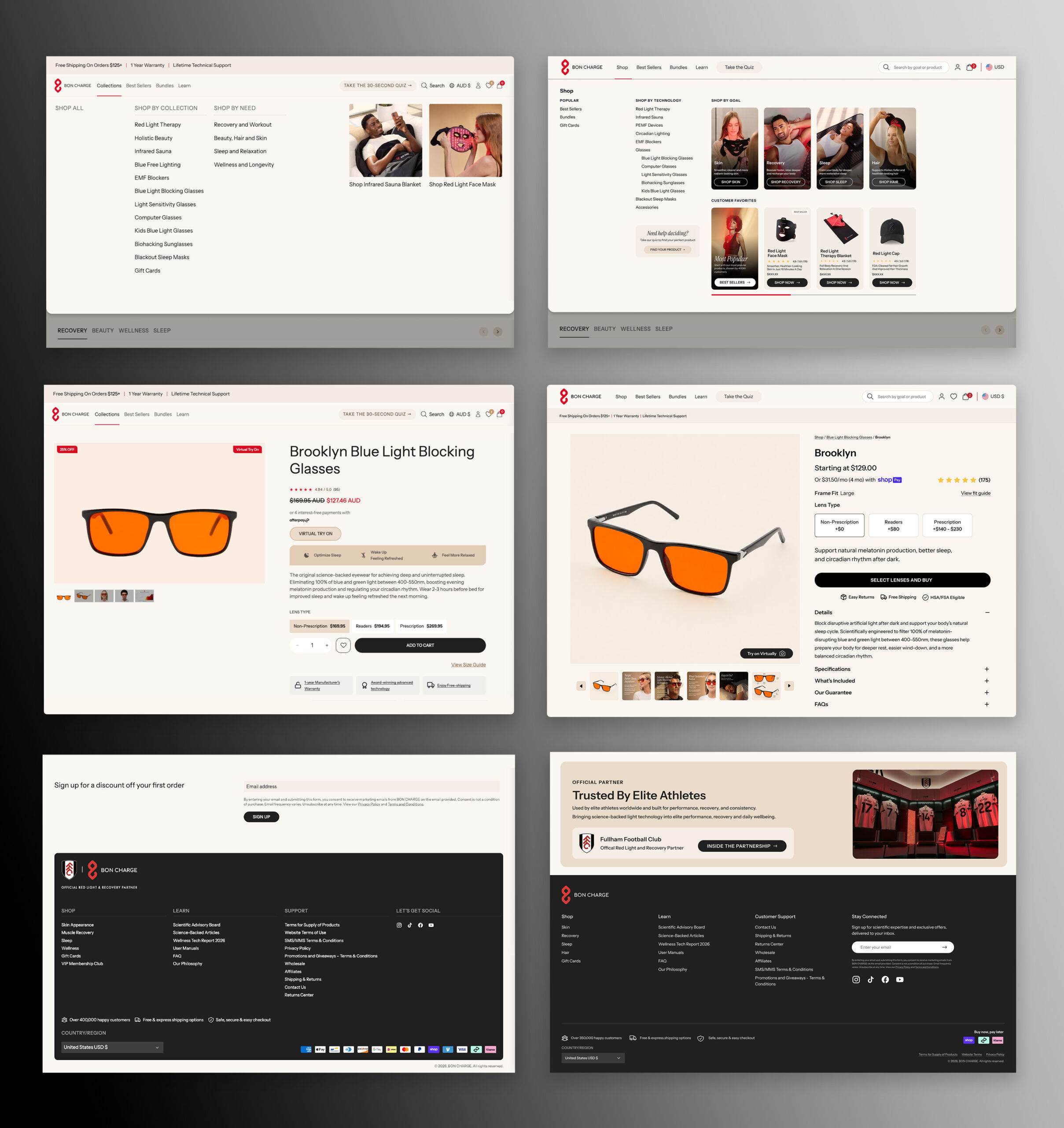
- Navigation redesign – I consolidated 13+ mega-menu items into grouped categories and corrected link routing
- Footer redesign – I rebuilt the footer hierarchy, resolved logo-sizing and brand name inconsistency across header, footer and checkout
Product discovery & configuration
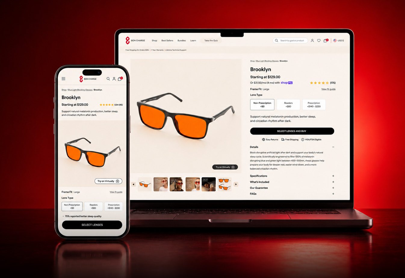
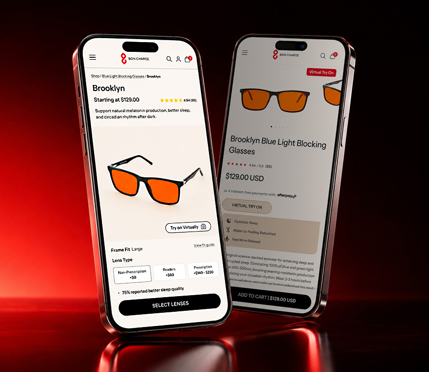
- Multi-variant configurator – I redesigned the Glasses PLP flow with a configurator that guides the user
- New product image specs – I set image dimensions and product positioning / cropping rules to fix undersized PLP thumbnails on mobile and products obscured by badging
Design system foundations
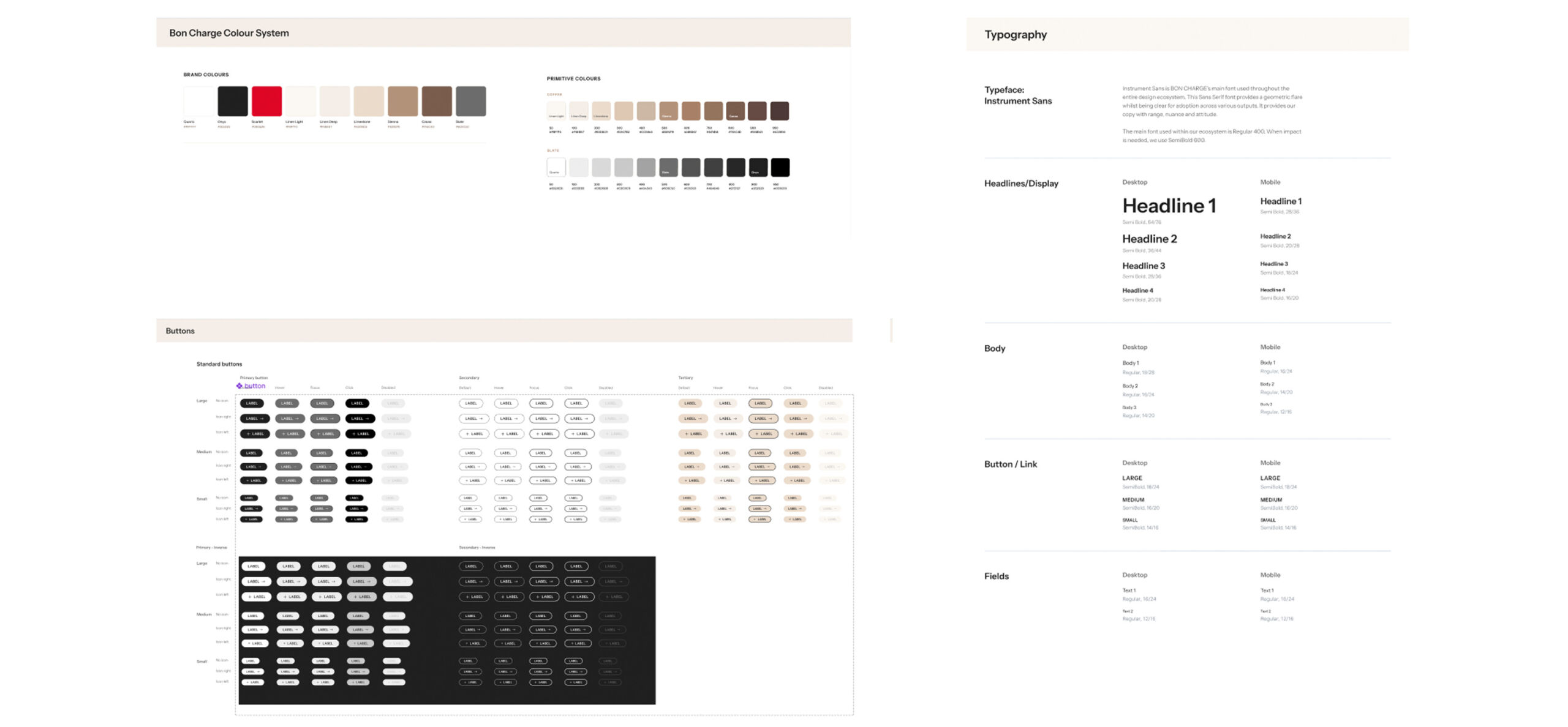
- Colour, button & type system – I built a new design system to resolve inconsistent CTA, text and colour styling found across the site. This reduced design QA and streamlined design-to-dev handoffs
- Countdown timer component – I redesigned an outdated countdown timer, built as a reusable component for testing
Content & conversion
- Learn LPs – I redesigned and templated pages for About Us, The Blog, FAQ and the Scientific Advisory Board
- Collection banner redesign – I reworked hero copy contrast and layout where text legibility against imagery was flagged as a friction point
- Homepage A/B test – I prepared tests for static image vs looping video hero, including pause control for accessibility
03 - Process
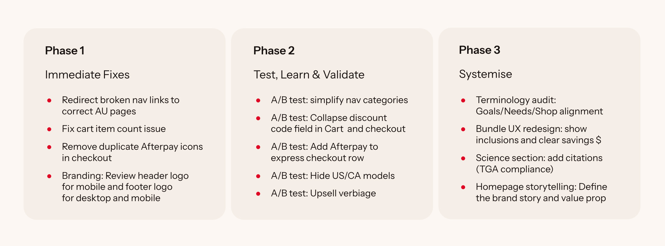
The audit set the sequence, not the other way round.
Findings were triaged into 3 phases. My work sat across all three, from bug fixes to the content system.
04 - Outcomes
Every initiative closed a gap, as evidenced in the audit. The design system helped to remove inconsistency and friction across the site. A/B tests (hero format, nav structure, product model visibility) were structured as single-variable tests, so that we had clear insight into which changes moved the lever.
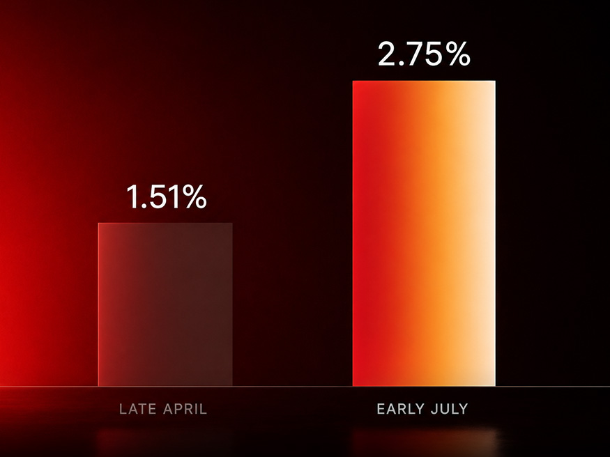
In early July, site conversion rate almost doubled from 1.51% in late April to 2.75%, following the PDP update, bug fixes and nav and footer redesign work.